Venmo Feature Integration
In this project our team integrated features into the popular money sharing app, Venmo, which allows users to easily send money to donations, charities, and do-good Kickstarter campaigns.
The Product
Venmo is a social money sharing app that allows users to pay and request money from their friends.
The goal of this project is to strengthen Venmo’s brand by offering options for social impact to make a positive difference in the world.
In this project our team makes it easy to send money quickly and easily to causes such as non-profit organizations, do-good kickstarter campaigns, and charities.
My Role
During this project I participated in Project & Product Management, Ideation, User Research, User Interviews, Usability Testing, and Feature prioritization.
Facilitated design studio
Created a usability report and aggregated the data to inform the team of trends and feature prioritization requirements
Assigned tasks based on the strength of each team member
The team consisted of 3 UX designers including myself.
User Research


Data Collection
We interviewed 2 groups of people:
Venmo users who donate to charity.
Those who collect money for charities.
We found these users using screener surveys.
Interviews consisted of in person and phone interviews, where users were asked 15-20 questions and lasted anywhere between 20-50 minutes.
We synthesized the data from these interviews using Affinity Mapping.
Insights
We crafted three user personas
User Type 1: Venmo users who donate to charity. We created Greg and Sam. Greg is a user who donates sometimes via friend’s recommendations. Sam is a user who volunteers often and is very active with her donations.
User Type 2: Those who collect money for charities. We crafted Rosa, a user who does not normally use Venmo, donates sometimes, and wishes there were an easier way to find charities.


Venmo users who donate to Charity want:
Ease
Trust
“ 1-click ease of use. If I could just hit button and have the donation go through, I’d like that...”
“Exactly what part of the charity would be helped by the donation; what are the specific allocation of the funds?”
Charities & Causes want:
More Exposure
Easy Collection
Our research led us to conclude that Venmo users…
Liked Venmo’s ease of use.
Were more inclined to give to charity if it was easy to do.
Gave to charities that they learned about through their own social circles.
Ignored or disliked the social network aspect of Venmo.
Problem Statement
How might we implement a feature into Venmo’s existing platform to encourage users to take action and give?
Feature Prioritization

Feature Mapping
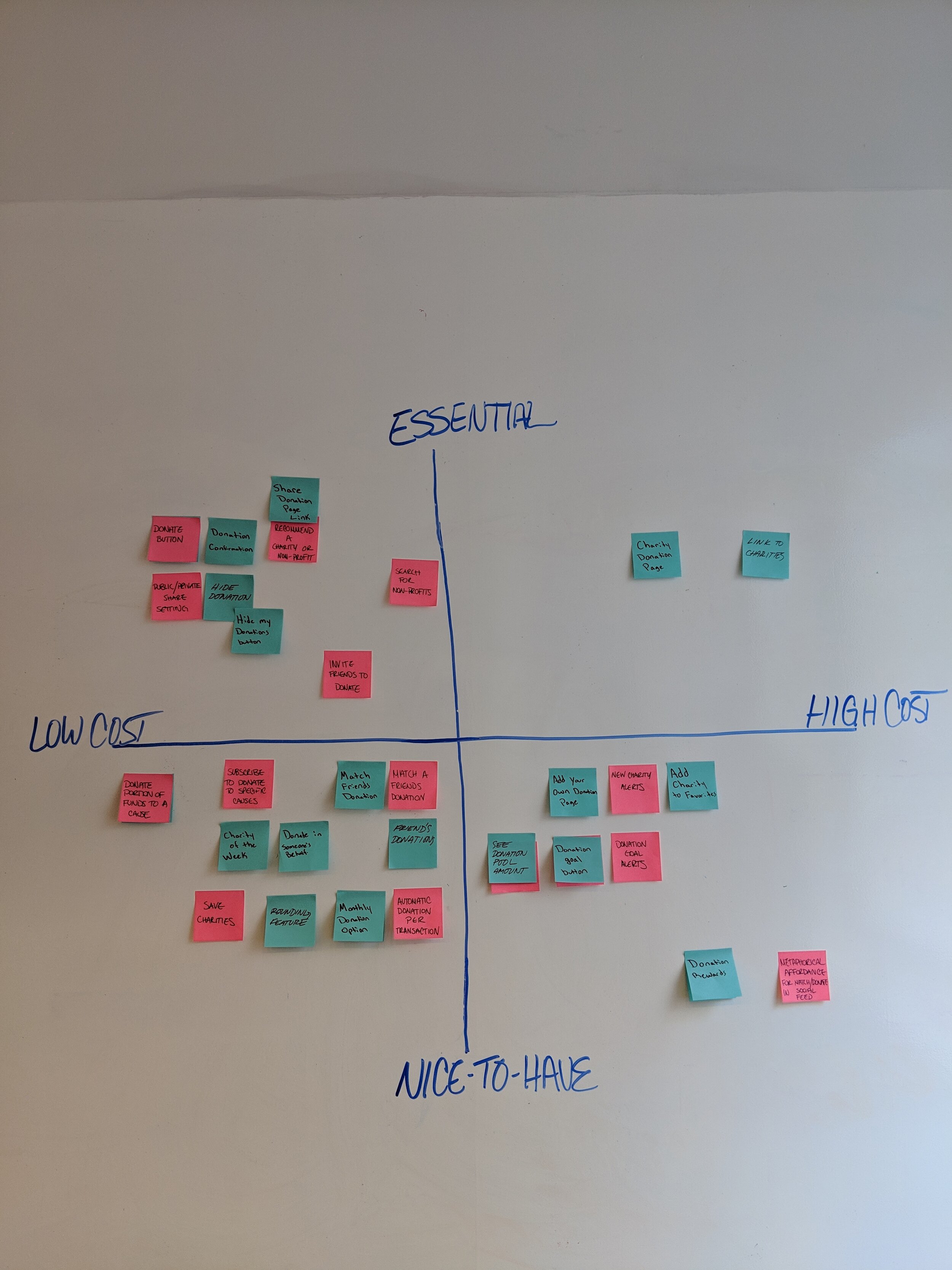
To decide on which features would be included on the final app, I led the team in a few workshops. We used tools such as:
MoSCoW map: Tool used to determine which features we Must, Should, Could, and Would not have in the future app.
2x2 Evaluation Grid: Tool used to determine which features would be most feasible to implement based on cost and time to build.
User Flows
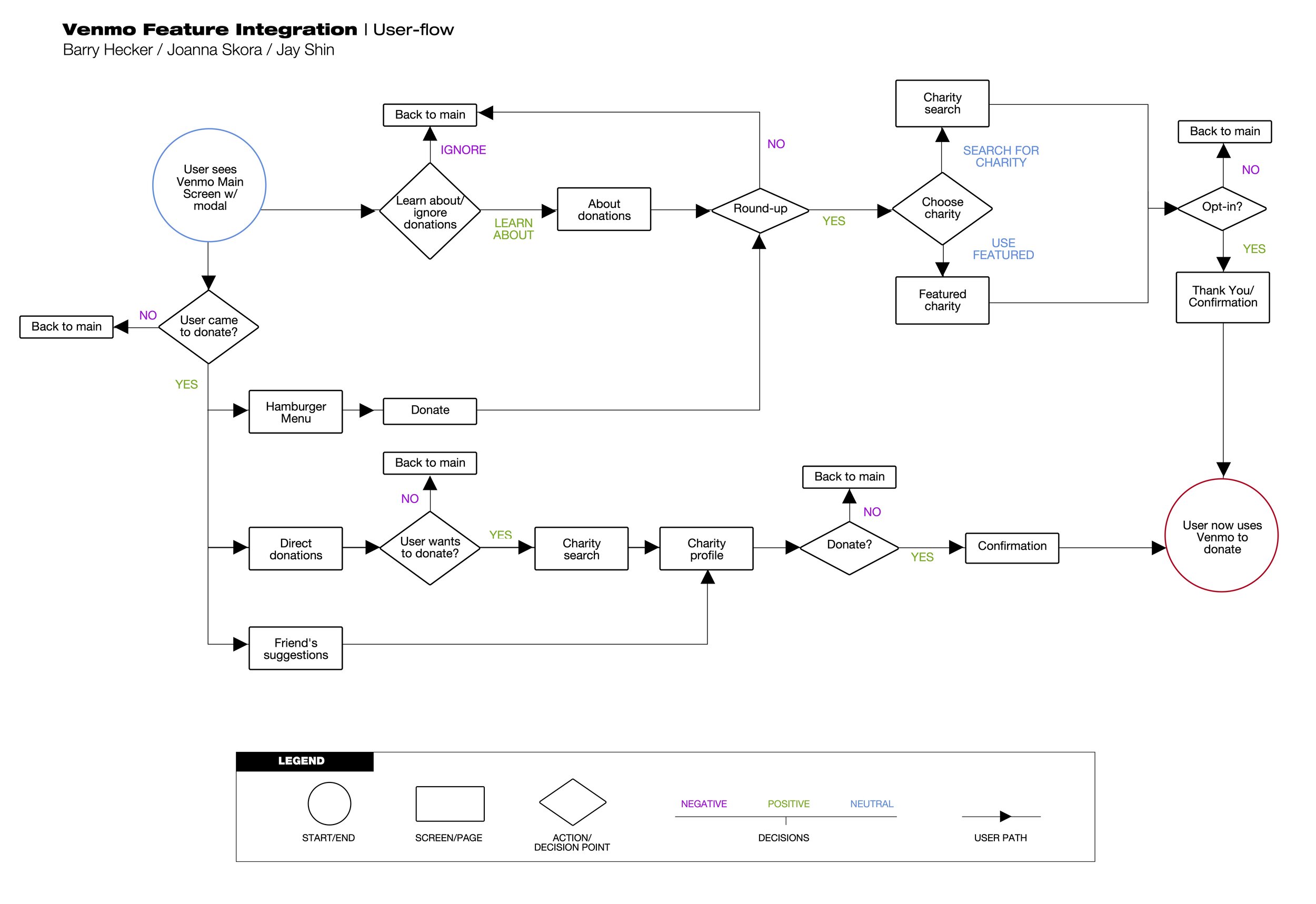
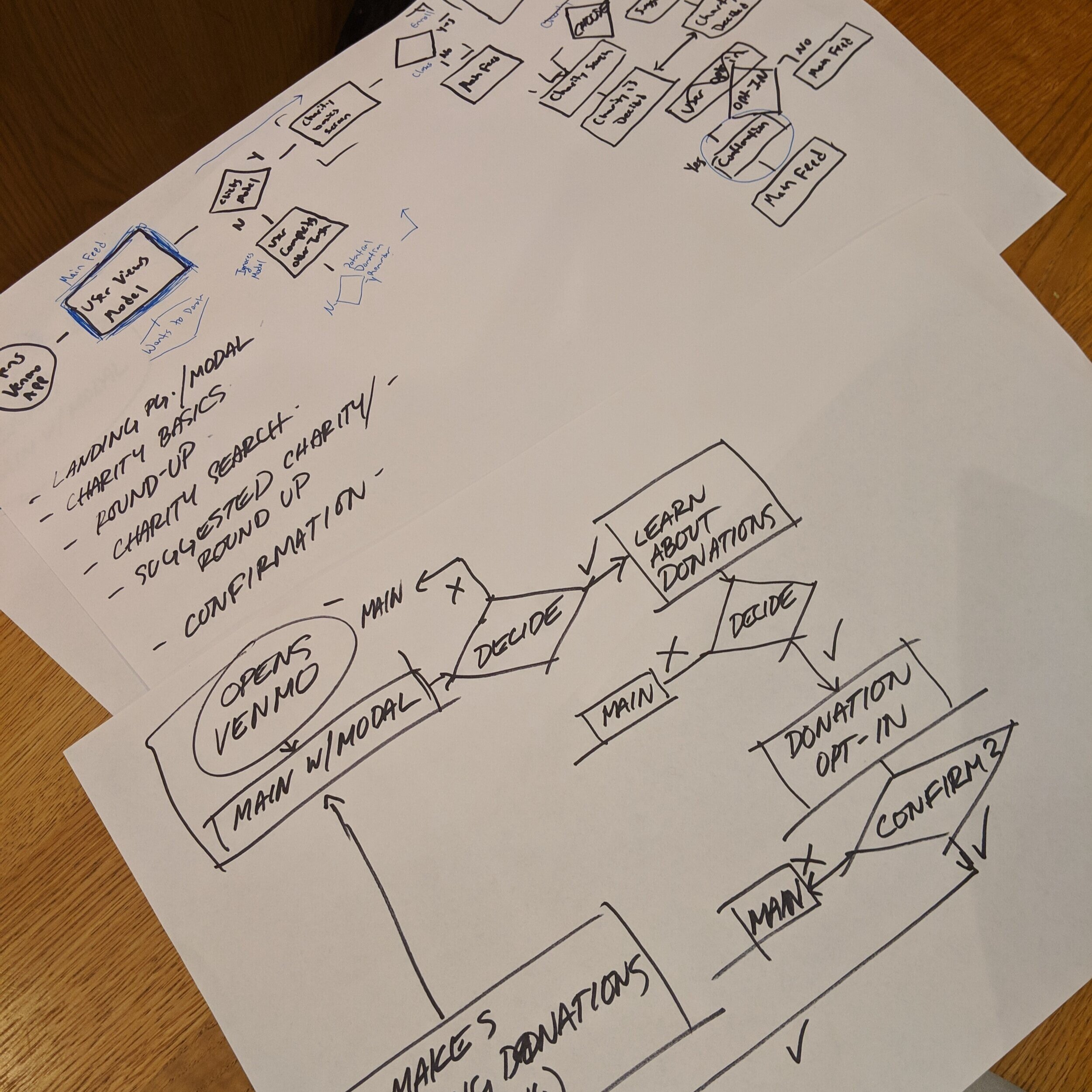
Before diving into screen designs, we made sure to develop user flows to ensure the user would be able to properly complete each task. We graphed out the steps and each button and decision the user could make along their journey to complete a task. From this, we were able to correctly decide which and how many screens we would need.


Design Studio
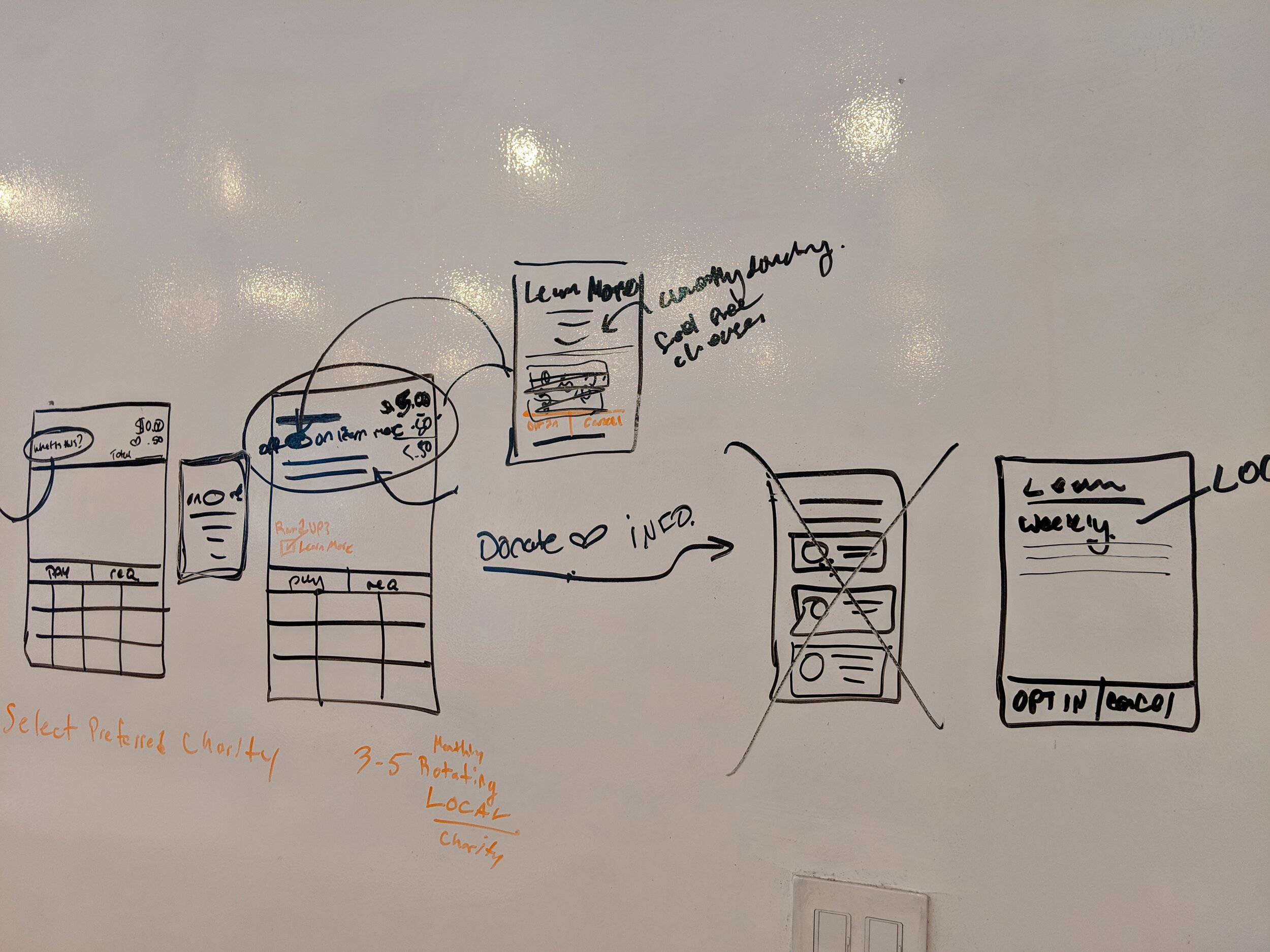
After figuring out which screens were necessary, I led the team in design studio so everyone could get out some ideas about how to integrate features into the existing Venmo app.
We used a practice called Crazy Eights where all team members sketch out eight ideas for screens using pen/marker and paper
Using paper sketches initially allows for a higher flow of ideas with minimal cost and time.
Final Features:
Charity Search Bar
Sign-up/Opt-in Window
Charities & Causes Profile page
Donation Button
Direct Donations & Donations within Venmo transaction page
Privacy Settings
Design
Mid Fidelity Designs
Info Screen to explain new Donate Feature
Home Screen with Round Up & Donate Button
Page to Search Causes within Venmo
High Fidelity Design
Info Screen to explain new Donation feature.
Home Screen with spotlight on partnered charity.
Payment Screen with Round Up & Donate Button
Usability Testing
Users were given two times tasks to complete. We tested with 5 participants who qualified for testing through a screener survey. We ran two rounds of testing. The second round was ran after making iterations based off of feedback from Round 1. All participants were able to complete tasks, but many took an unexpected or roundabout path. We learned many areas for improvement that would have been otherwise unknown.
Round 1 Resulting Design Changes
We changed the flow to give icons a more prominent space inside of the app.
Added more confirmation screens, after successful prompts.
Prevented users from jumping ahead by adding error states.
Added a new user flow with an option to search.
Edited the copy to explicitly state what the feature’s purpose was.
Added more modals that kept users on the same page.
Round 2 Resulting Design Changes
Add color, even to mid-fi wireframes, to better articulate our solutions.
Give the user clearer options to change the charity they give back to.
Make the onboarding screen clearly state what the user is signing up for.
Continue to make CTAs bold.
Minimize modals in transaction screen to opt in. Keep opt in feature separate. Keep “what is this’? But move closer to icon signifying auto donations - have what is this bring up pop-up that asks to take you to that part of the app.
Next Steps
Continue working on our app concept and tighten up some of the user flows.
Have a developer code some basic functionality into our app: user-testing has shown many errors that could be corrected with a better developed prototype. One issue we ran into was that change states cannot be illustrated with the current prototype, confusing users during their tasks.
Users also responded to large format buttons inside our app, leading us to believe any calls to actions should have a clear contrast with the site’s existing body.
Based on testing, both experienced and novice users appeared to need more explicit prompts as to where to access our new feature, as well as to whether the feature was used successfully.
In conclusion, another iteration, possibly two, followed by user-tests would bring us to a successful feature integration.


